New Look, Same Mission: Introducing Intertek Alchemy
When Alchemy joined forces with Intertek last year, we dedicated ourselves to designing a new look and logo to reflect the visual power of this alliance. It was hard keeping our new branding under wraps for a spell, but saving the debut for the 2019 Alchemy Engage conference was worth it. Take a look!
We’re Not Changing — We’re Expanding
President Mike Grigsby unveiled our new look at this year’s Engage conference, noting that while the name look has changed, the spirit of Alchemy remains the same. Intertek Alchemy remains committed to helping you build strong safety cultures, and powering your workforce. In fact, “Powering Your Workforce” is our new tagline!
How Alchemy and Intertek are a Perfect Fit
Intertek has a long, successful history in providing assurance to customers that their processes and products are as safe and efficient as possible. But there was one important piece of the production puzzle that was missing — the workforce. By bringing Alchemy into the Intertek family, Intertek’s Total Quality Assurance is indeed total: confirming their customers’ products, processes, and people are safe, efficient, and compliant.
For existing Alchemy clients, this evolution to Intertek Alchemy does more than increase the power of our brand. It ensures a long-term commitment to innovation and growth, enhancing our power to connect you with the very best resources possible for training and motivating frontline team members.
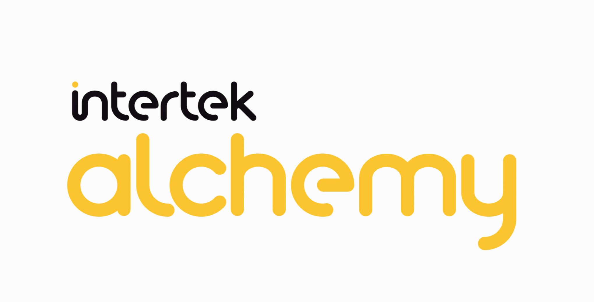
Why Yellow?
You may have noticed a new look on our website, too. Our logo colors represent a long line of thought, inspiration, and intention.
Thought: There’s a lot of significance in the exact hues chosen to represent our new logo — this shade of yellow elicits feelings of optimism, warmth, and clarity.
Inspiration: Yellow is also known as the color of illumination and is symbolic of innovation and new ideas, which is what drives our business — and your success — forward.
Intention: You also may have noticed the bright dot over the letter ‘i’ in Intertek. This signifies the spark of ingenuity. The concept and dedication to innovation is part of Intertek’s DNA, and can be traced all the way back to the invention of the incandescent light bulb, through Thomas Edison’s Electrical Testing Laboratories (which to this day is the meaning behind the ETL certification stamp that signifies a product is tested by Intertek).
Plus, yellow just stands out. We like that.
Stay Tuned
We’re simply thrilled about our evolution and the impact our relationship with Intertek is having on our output — it’s already enabled new product enhancements and developments that make your job easier, so be on the lookout for more big announcements in the near future!